
Research
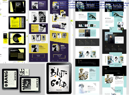
The next assignment was to feature our spreads into a interactive PDF. I firstly researched some online magazine spreads and took some inspiration. I began to think about what extra pages I wanted in my work. I thought about influding content to do with tours and a behind the scenes look to one of the concerts Joji was featured in.
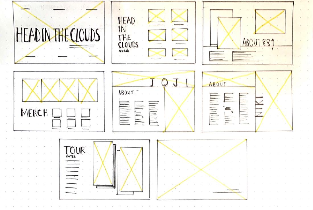
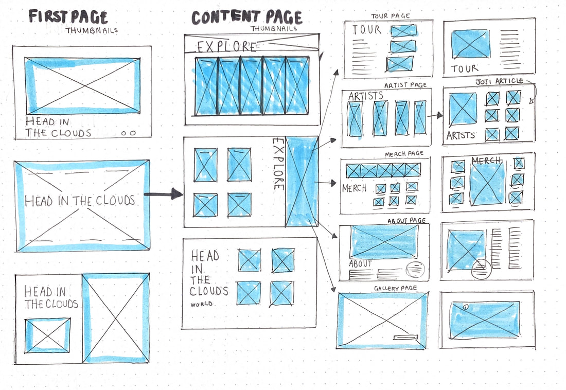
I Began to draw out some designs for the pages. I took inspiration from the previous thumbnails I designed for my magazine and thought about what would look best and the most appropriate for my designs.
I also began to think about the features of an interactive PDF such as the buttons, transitions and extras such as audio files and slide show images.
I Began to draw out some designs for the pages. I took inspiration from the previous thumbnails I designed for my magazine and thought about what would look best and the most appropriate for my designs.
I also began to think about the features of an interactive PDF such as the buttons, transitions and extras such as audio files and slide show images.

I gathered some extra images as I felt it needed more Behind the scenes content.
I also ended up going for an orange and blue theme to my designs, as I felt it contrasted the best and looked more visually appealing.
I also ended up going for an orange and blue theme to my designs, as I felt it contrasted the best and looked more visually appealing.
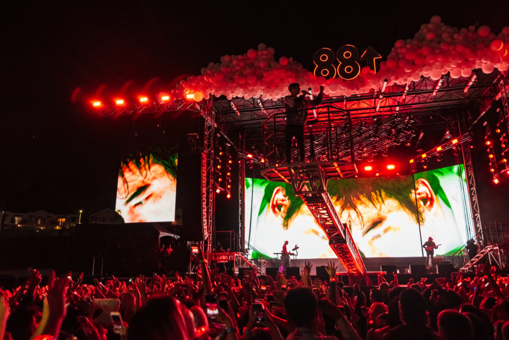
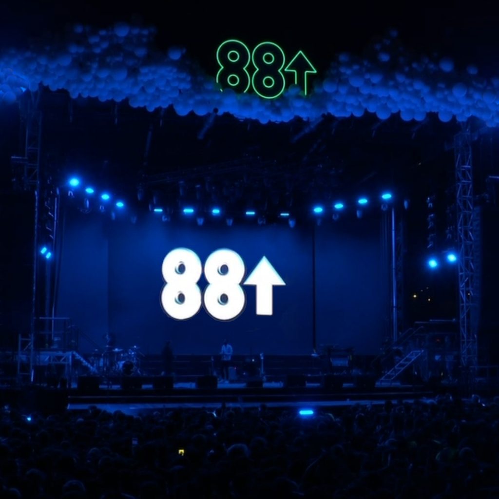


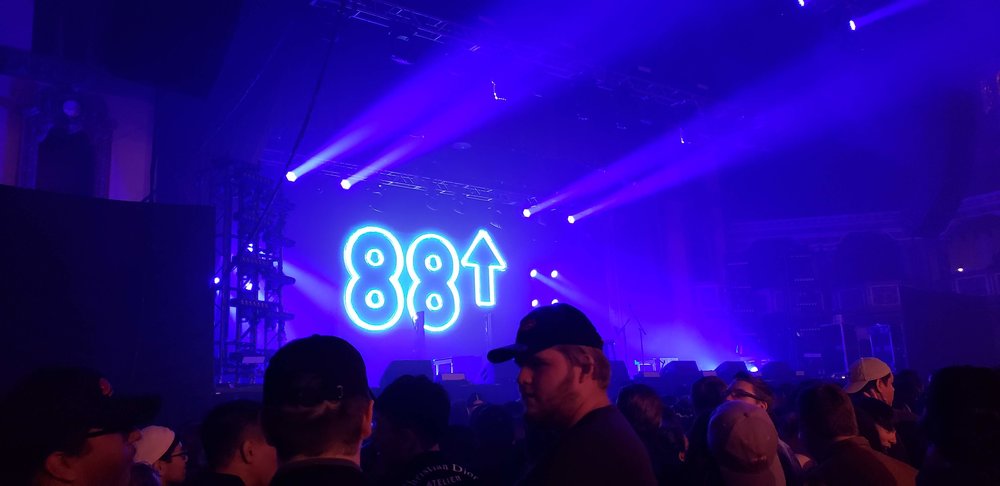
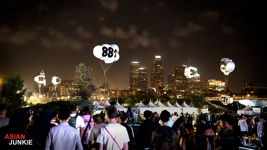

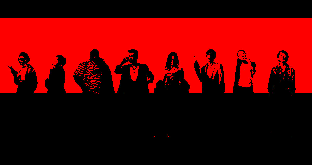
When gathering images I was unsure what over all look to go for, I found this image and decided to play around in photoshop and create a two tone image. I liked how it looked but didnt end up using it as it didnt cohere to the rest of my images.

These were a few of my first pages! as you can see the blue and orange theme runs pretty good through these first spreads. After the feedback I recieved I was advised to change the typeface I used in order for it to read better! So I changed it.
The titles I used were all different and didnt match typewise with the other pages, so I made sure they were all the same and cohered together well.
I included animations in my work, the text and titles would fly in from different directions and land back onto the page nicely, I felt this was an important factor as its a good feature to use when creating an interactive PDF. All my icons I used were linked with social media pages to do with Joji and the tour and would take you directly to these websites. Even the merch page was linked too!
I added an audio file over the PDF which I felt threw you into the music world really nicely and would be enjoyable for the viewer to listen to whilst delving into the behind the scenes of the tour. I also added a video page that could be played by the viewer so they could watch all the events!
The titles I used were all different and didnt match typewise with the other pages, so I made sure they were all the same and cohered together well.
I included animations in my work, the text and titles would fly in from different directions and land back onto the page nicely, I felt this was an important factor as its a good feature to use when creating an interactive PDF. All my icons I used were linked with social media pages to do with Joji and the tour and would take you directly to these websites. Even the merch page was linked too!
I added an audio file over the PDF which I felt threw you into the music world really nicely and would be enjoyable for the viewer to listen to whilst delving into the behind the scenes of the tour. I also added a video page that could be played by the viewer so they could watch all the events!


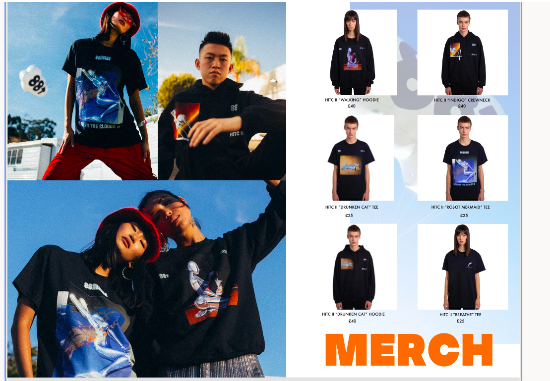
These are my final design spreads for my interactive PDF.


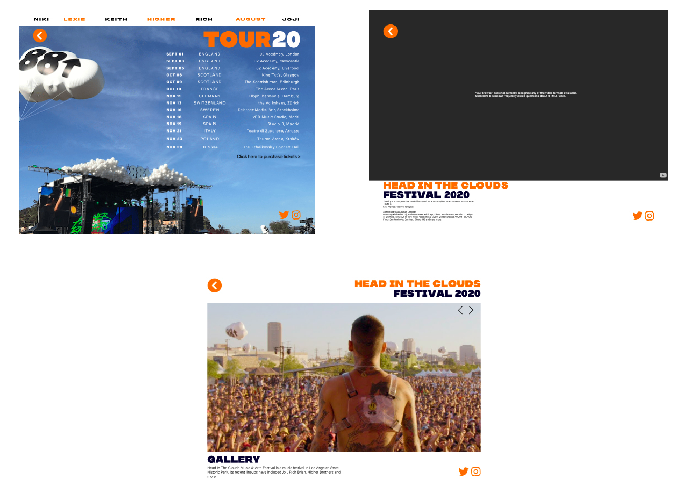
Interactive PDF link :
https://indd.adobe.com/view/c5a75db9-0e84-4a37-927f-00de35331dbf
https://indd.adobe.com/view/c5a75db9-0e84-4a37-927f-00de35331dbf